
Today I became aware of two website redesigns that use the principles Chris Lackey talked about in his presentation.
First when I opened weather.com this morning to find out what Boston’s weather was suppose to do today. There was an announcement of its new look. I skipped the video tour and proceeded to the site.
It has made movements (following iOS7 no doubt) towards a flatter design. Here’s what it looked like this morning:
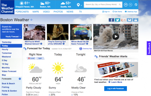
At the top you will notice how none of the recent location look like buttons. And there is no indication that they drop down menus drop down…

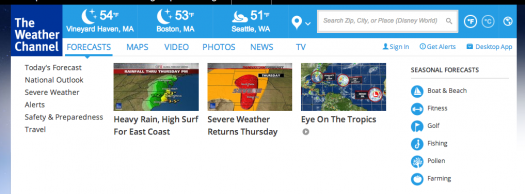
…until you hover over it with your mouse:
Lets take a look at the social media buttons, they are flatter.

“And now for the weather”, a closer look at the forecast for this evening shows us that the symbols for the forecast: the clouds and the moon are vectors. Earlier today there was a lovely vector sun. All very simple aesthetic and flat.

One feature not included in this redesign is responsiveness. But don’t worry they have an app for all you smartphone users out there.
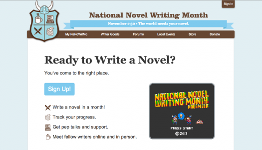
This evening in my inbox learned of the second redesign “A New Face for NaNoWriMo 2013”
The aesthetics are also flatter on their new site:

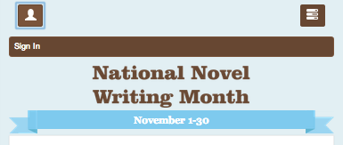
And it’s responsive:


Notice the buttons for signing in and navigation in the top corner of the skinny version.


And just for fun, this is what the page looks like when you’re signed in.


Unfortunately I won’t be able to to take full appreciation of the redesign, at least not this year.

You must be logged in to post a comment.