Design Exemplar: I didn’t know what to do so I did Eurovision

Please ignore the right hand side of the upper banner where Israel and KAN decided they needed to proudly display the fact they didn’t have the money to host this whole shindig by themselves. It looked much better before.

So, uh, besides like the cesspools of Twitter, YouTube, and Reddit and a various assortment of other websites, I don’t traverse the depths of the web that much (or at least, as far as you need to know.) As a result, I’m left to go with the Eurovision website because it is, well, designed and also in English. It is also my one true love and obsession, so there is that too.

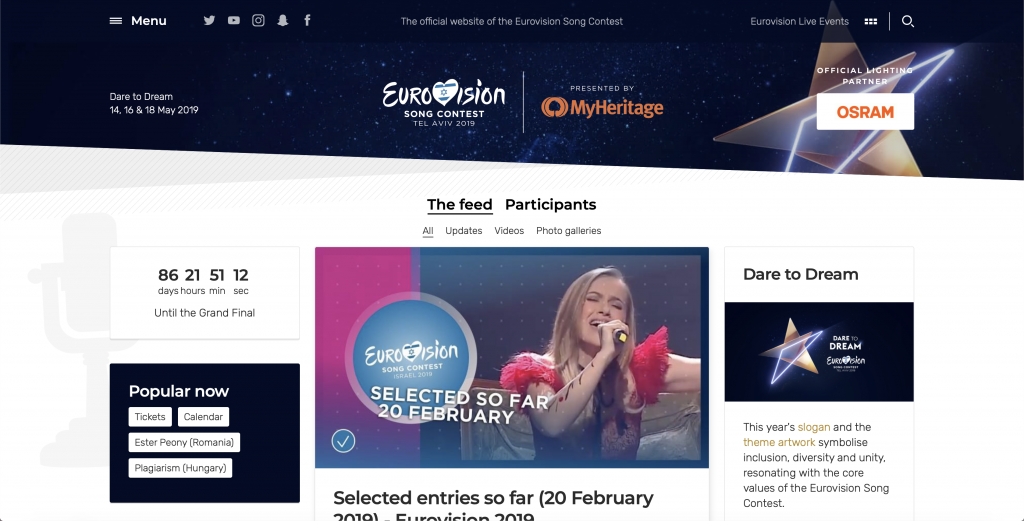
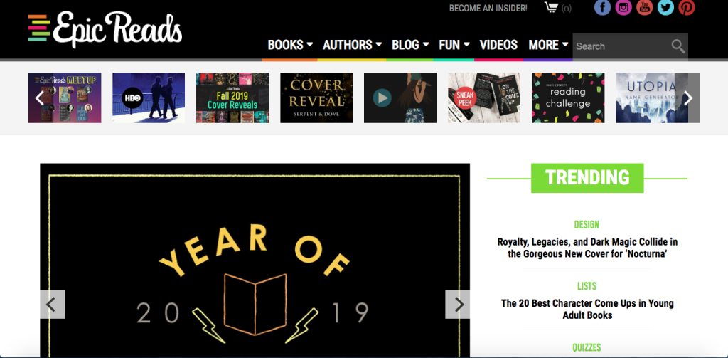
Let’s begin with the positives. There’s a clear minimalistic color theme of blue and white and the top banner has all the essentials (a menu, social media, event tickets, and a search bar.) There’s a most recent feed, which links to general contest updates across Europe and also kind of Asia and Australia.

The negatives? It’s kind of a cluttered homepage. You have the aforementioned feed, a descriptor of this year’s theme and logo, a countdown, popular tags, a randomly generated throwback tab below the tags, and a merchandise tab. It is a bit much. Also KAN’s desperate need of funding and sponsorship being tastelessly displayed in the upper banner. Besides all that, the website is mostly fine.

Where the site is strongest, I’d argue, is the menu page.

There is no reason why you shouldn’t be able to find what you’re looking for here.

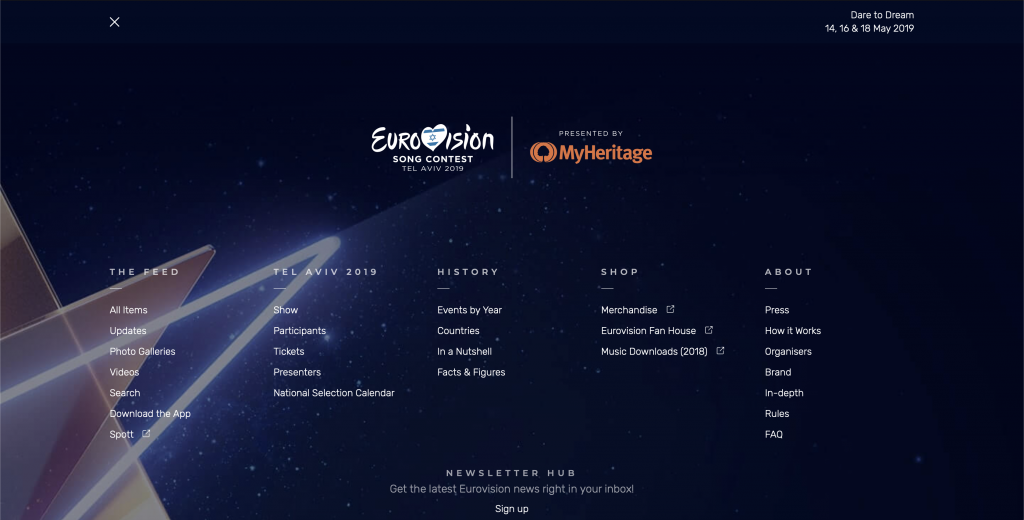
I’m very fond of full page image background with white text, so this just fits my aesthetic in general, but it is efficiently functional. In fact, I’d argue they’d do well to take this, modify it a bit, and turn it into the home page proper.

Just looking at this, there is no reason why you shouldn’t be able to find where you’re going. All the important information for this year has its own column if you need to find out if San Marino is going to bless with our one true queen Valentina Monetta or not, previous years are all allocated under history in case you want to look at the year Morocco participated or, y’know, learn the Morocco is the only African country to ever participate at all.

Going a bit deeper, pages in the website fall into two categories: a page that uses all three columns, and pages that use only the center column.

The participant pages, for example, are the former type.

For the pages that use all three columns, including the homepage, they are generally prioritized in the order of the heading section first, the middle column second, the left column third, and then the right column fourth. In the example above, you have the basic information of the entry as the header, a brief description, embed videos, and lyrics in the middle column, composition and performance information and social media links on the right, and how and when the song performed (in this example, only the semi-final allocations have been drawn thus far, so only that information is available.)

My biggest design complaint for the participant pages in particular is that I wish the nation’s flag was displayed more prominently and that the feed below all the important stuff would, uh, not exist.

Overall, outside of a few grievances, I’d like to think that the Eurovision website is decently designed. It’s certainly functional and is useful for related research.

Design Exemplar – A Good Movie To Watch

A site that I started recently using for suggestions when I’m in movie and TV show binge mode is A Good Movie To Watch. I love this website because how minimalist and clean the design is. The way the lists of movies are displayed is easy to look at and uncluttered. The website is also very user friendly because it is easy to use the navigation bar to find what you’re looking for. Also, there are various ways to sort what kind of movies and TV shows come up. You can find movies and shows by mood, what type of characters are in it, what mental place your in, the rating, and the language.

Although this website isn’t the most visually appealing with its color scheme or images, it is nicely designed with how minimal it is and how white space is used. I think it would be easy for a website that has a lot of information or lists like this one to look cluttered or unorganized if there were more design elements at play.

For my own website, I would definitely think of adapting the navigation bar and how intuitive it is. I would also consider how to present my information in a way that is easily digestible. Ideally, I would want my website to be more visually appealing while maintaining the cleanness and organization of this one.

Homepage
“Best Films” page found under “More” Tab.
“Mood” page has various ways to sort through movie tags.

Who needs to read?

https://frame-optik.de/

I’ll be honest, I can’t read a word on my favorite website. It’s a German site that I think is trying to sell eyeglasses but it’s so pretty that it doesn’t matter. I guess pretty isn’t exactly the right word: it’s more that very act of interacting with it is fun.

I’ll admit that I’m generationally stereotypical trash and love scrolling. I mean not the content from it but scrolling as a way of revealing content. The promise of near endless content compared to constricting nature of finite pages. The scroll also engages the reader in a continual process of interacting with the media rather than occasional page turn. And there is no stress relief like angrily flying past a bunch of posts after seeing some conservative bullshit.

But even to someone willing to admit my obsession, not all scrolls are created equal. Parallax scrolling is a concept in web design that refers to displacement of the apparent position of an object when viewed from different points. It’s most common application is “where background images move past the camera more slowly than foreground images, creating an illusion of depth in a 2D scene and adding to the sense of immersion in the virtual experience.” Not to belittle the importance of immersive web design, but parallax scrolling has the possibility to do much more. It is not inherently tied to the concept of back and foreground image and it can allow one to set any part of a website at different scroll speeds. So if one were to divide the site in half and set the left to normal scroll and the right to variable scroll then one can create a system of responsive page lengths.

It should be noted that this site looks so good (though you can’t see the parallax in the screenshots) not just because of the scroll but also the multitudes of decisions around it. From the elements maintaining momentum and giving a little bounce to collapsing white space, it’s just so damn pretty. This site’s amazingly pulled off parallax scrolling not only gives me endless entertainment but also represents a potential point of innovation in digital publishing.   

Design Exemplars: The Knot

When I was planning my wedding, theknot.com and The Knot magazine were my go-to’s for everything as I prepared for the big day. I was pleasantly surprised when I revisited the site after six years to find that all the things I loved about theknot.com had stayed the same: easy-to-use menu bars, the simple yet elegant logo, and the gorgeous pictures and videos throughout.


Looking at the screenshot above, you can tell that the logo has been cut off, but that’s only because of my iPad. If you visit the link at the top of the post, you’ll see the entire logo. It’s simply “the knot” in blue cursive script. I love simplicity of it. There’s no over-the-top symbol created just for their company. The words are large enough the catch attention, but aren’t in your face. The blue is not showy either; It’s elegant. The simple elegance of the logo is something I would definitely want to adapt into my own website. I don’t want a symbol, only a clean cursive script like “the knot”.

Another great design is the easy-to-navigate drop down menus. While there are many tabs (because planning a wedding is a HUGE undertaking), the font is large enough to distinguish each tab. Each tab has a drop down menu that delves deeper into each aspect of planning a wedding. Like many others, I’m sure, I get frustrated if a menu isn’t thorough enough and there is no search bar to help navigate the site, so I love theknot.com’s menu. Their menu is so thorough that theknot.com’s designers feel confident enough in their menu designing skills that they don’t need a search bar. While I agree that they don’t need it, I think the search bar is always a good safety net in case a new user to the site gets lost. I will definitely be adding a search bar to my site for this reason (if I can).

The next design element of note on theknot.com is the beautiful wedding photographs and videos right below the tabs/menus. They are designed to be inspirational and aspirational. They are crisp, vivid, and flawless. I, for one, much prefer to look at a photo rather than a drawing or any design that originated on a screen rather in real life, so I will also be using photography and videos rather than animations or drawings.

As you scroll down the site, there are helpful tools that will help those who don’t have a clue as where to start planning and brainstorming. Accompanied with these tools are great photographs to draw you in. In the photo above, you can also see sketches alongside photos. I think it is effective to use both in a way that neither overshadows the other.

The photo above shows what you’d find at the bottom of the site. It is a smaller menu (of the most important wedding details) with descriptions and visuals, if the tab menus were a little overwhelming to navigate. I like this kind of menu because users get a small description of where they can go and cute visuals. As someone who understands what it’s like to be overwhelmed and unsure where to begin, a menu like this would help ease some of that stress by starting simple.

Overall, I really love theknot.com. I appreciate the use of pastel colors and white space because they aren’t overwhelming. Wedding are stressful enough, so wedding planning tools shouldn’t be. I like the easy-to-navigate menus that cover every aspect of wedding planning you could ever need, as well as the small menu at the bottom. I love the beautiful photos and videos; I even enjoy the little drawings that compliment the photos. My only critique is that there is no search bar. Again, planning a wedding can be overwhelming, so the smartest person may have trouble navigating a very simple site. Adding a search bar, would definitely help this person out and also make it a quick access for those who know exactly what they are searching for.

Design Exemplar – Travel

I’ve been to multiple countries over the past few years, including Germany, Austria, Switzerland, Italy, Greece, and Turkey, and this summer, I’m flying to London and then spending two weeks traveling around France. My aunt and I tend to be the planners for these trips (9 of my family members always accompany me) and it can be overwhelming trying to decide what 10 different people will enjoy doing and seeing. That being said, I found Afar.com quite recently, and thank God I did. It’s an extremely useful website when planning a trip, but that’s not all it offers – the posts they publish give readers valuable information about various cultures and take them inside the minds and lives of other people across the world. Not to mention, I personally find the site to be a beautiful mix of words and pictures (I’ve always thought travel photos were the best kind of picture).

AFAR Homepage

The homepage can feel a bit cluttered at times, but is actually quite easy to navigate. It reads like a blog and its use of hierarchy between subtitles and thin dividing lines makes differentiating between sections simple. The best feature, in my opinion, is the search bar at the top of the homepage. The background photo behind it changes when you refresh the page, offering a different view each time so as not to feel stale. In the search bar, you can type in any city in the world and get redirected to a travel guide. I’m going to London in July, so I’ll provide screenshots of the results for that city.

London Travel Guide

Each individual guide contains the same information – a brief overview and small map of the area, and then subheadings regarding where to stay, eat, drink, shop, and things to do. Relating to the subheadings, the font on each page is consistent and their use of sans-serif makes everything legible.

London Hotel Guide

For example, by clicking on the “where to stay” tab, the user is taken to a page with pictures of suggested hotels. By clicking on these pictures, you are then taken to another page on AFAR that offers a rundown of the hotel in question along with an address and a map to show where it is located in relation to the city. All of these interactive features are what makes the site so useful.

Travel Photography – Africa

Going back to their photography, although a lot of pictures are peppered in throughout the site in general, there is a link under “inspiration” titled “travel photography” that will take users to a page filled with different topics to explore through the photographs. For example, the photo above was part of a travel photography based article in sub-Saharan Africa.

In conclusion, I believe AFAR’s website is constructed in a way that balances their contributors’ beautiful photography with an abundance of information. Their use of menu bars makes things efficient, and as someone who has always wanted to start a travel blog, it’s helpful to see how a successful business sets everything up. At first, I was considering using more interesting fonts, but seeing how clean everything looks with a sans-serif might make me reconsider. I’m always definitely going to use menu bars to make my future site easy to navigate. Something I will take into consideration though, as I stated earlier, is how much I’ll put on one page. While the lines and headings help to clean up the jumble on homepage, it does still look cluttered at first glance.

Design Exemplars – Food (and Wine!)

One of my absolute favorite websites to browse and get ideas from, is www.foodandwine.com. I am a cook who takes pride in every dish I make, from beginning to end. Beginning – quality ingredients (this in no way means that they have to be very expensive, but quality is imperative), prep area, tools (yes, great tools are essential in the kitchen). End – taste, clean up, presentation (almost as important as the taste of the food), and feedback.

Food and Wine (F&W) is the epitome of good (looking) food. Their photos speak long before one even learns the name of the dish staring from the screen. I’ve been a fan for over a decade and have tried many of their recipes. Well, not recipes per se, but I’ve looked at photos and learned the name of the dish, then recreated them to reflect my own tastes, and that of the people for whom I cook.

In the photograph below, the completed dish is evident without a recipe. The site is easy enough to navigate, so that the user can quickly find what they’re searching for.

Landing page of https://www.foodandwine.com/

Specific recipes and information can be easily located by utilizing the search area at the top right of the home screen, or by selecting the “recipe” tab at the top.

In the past, there have been stories related to food but with a human focus. One such story was the death of Anthony Bourdain, and the way in which he embraced food, people, and life. The topic spanned those qualities of the chef, but also how much the food culture has been sidelined from serious talks and action regarding mental health. https://www.foodandwine.com/chefs/anthony-bourdain-restaurant-industry-mental-health
The author of this piece, is newly named F&W Senior Editor, Kat Kinsman, a food writer whose knack for describing a dish, or a person, just gets to the heart of her reader. She is funny, quirky, and a little snarky, but she knows her audience, and most importantly, her craft.

For my website, I would definitely continue along the vein that I have been going. Writing about food, life, mindfulness. The concept of cooking with love and cooking what’s loved, is very important and thus would be displayed throughout. Photographs will be dynamic, bright, colorful, and would portray the passion that I am eager to share with others. Writing will not just be relegated to food and recipes. Some history (personal and otherwise) will definitely accommodate each piece.

The key to building a successful website is of course, easy access, uncomplicated navigation, and actual content that indicates the user has chosen the perfect site to browse and gather information for their specific needs.

This photo was taken by me, after planning and preparing (in under 4 hours) a meal for my husband’s birthday two years ago.

The Power of Pictures

We live in such a visually driven world that any website without pictures is outdated, even if it was made yesterday. High quality images are an absolute necessity when designing a website, whether they be photographs or illustrations, but images are only part of great design.

There were two websites I was torn between for an analysis. For those curious, I’ll share my original choice and why I changed it. BohoBeautiful.life is a site I frequent and the photography and videography alike are stunning. If you’re going to make a living as a social presence, your camera presence needs to be compelling, and this husband and wife duo have it mastered. Cultural appropriation of the yoga industry aside, I’m totally bought into their vibe. I chose not to analyze their site because: I am too attached to their message and a majority of sites don’t use moving pictures. If you’re in the business of sharing information and stories (like myself), still images seem more likely to have a higher ROI (return on investment) than videos. If you’re selling something, anything really, videos are well worth the cost because it attracts customers.

Apothecarytinctura.com, the site I chose to analyze and, ironically, not one I’m familiar with, is an herbal shop’s website and I adore their aesthetic. The images draw the eye and inform viewers what the website is about without any need of description. (Well-placed headers and descriptors make this accessible to those using auditory versions of the site.) For this reason, the design is fairly simple. Dramatic pictures and simple design are trending, but then again, it’s always been trending. (Check out Alexey Brodovitch’s spreads for Harper’s Bazaar from 1920’s-1940’s and you’ll see just how lasting a powerful image inlaid in simple design can be.)

The home page features the above image after scrolling past a header with a white background. The white text in the image is a nice contrast to the darker colors of the table and seeds and provides legibility and aesthetic pleasure. Though the font is simple, the website combines sans-serif and serif for layering. Check out the website so you can see for yourself what happens when you scroll past the image. More of the image is uncovered and the text scrolls at a different pace than the image. It’s a little bit of interactivity that adds depth to the page that an image alone couldn’t. For those who don’t want (or can’t) add videos to their websites, involving movement with images is a great way to make a design stand out.

Scrolling further down, we’re brought back to the white background, same as the header. This section offers a lot of information without overwhelming the eyes. The same two fonts from the above image are used throughout, and for added dynamics, the sans-serif is bolded for emphasis. The images are still striking, now offering more color, but are not “interactive” in the way the main image was. Instead, viewers are still encouraged to take action with the popping “Learn more” buttons. Simple colors and fonts layered and contrasted with a keen eye can make for a compelling design.

Scroll further and the same yellow of the fonts is in the background of this image. A consistent and simple design attracts the eye rather than confuse it and is more likely to attract readers and buyers (Weinschenk). What works exceptionally well for this website is how the color scheme alludes to the brand. An apothecary featuring nature-based colors like greens and browns certainly fits the brand, but dark colors don’t incite action (sometimes they do, but not always the desired action). Color psychology is vital in having a reader buy into a website, whether it be a lifestyle blog or an ecommerce site, because people inevitably make decisions based on emotions (Weinschenk).

As great of a design as this is, there are some things I would change. The text in the above image of the flowers in the mortar and pestle is too hard to read because it’s white. Further exploration of the site reveals that all of the attention had been given to an amazing home page, but the quality subsides with each page further a reader gets from it. Quality headshots are imperative for viewers to take a business seriously, so whether or not a picture is cute to you is irrelevant. What your mouth and eyes are doing in a photograph are far more influential than that cute top you bought for the shoot. Great design knows how to incorporate movement in photography, such as using the direction the eyes are pointing, to drive readers to the next message.

All in all, the home page design represents a design that I am often drawn to, with an aesthetic and color scheme that personally appeals to me. Beyond personal preference, simplicity and consistency are integral to the success of this design. My favorite part of it: the interactivity of the images in scrolling.

Dr. Weinschenk, Susan. “How People Make Decisions.” SmashingMagazine, 7 February 2019.

Design Exemplars: Epic Reads

Although I admittedly don’t do much online browsing (save for news articles and YouTube video playlists), one site that I’ve been going to for years is the colorful and flashy Epic Reads–a “fandom” site by HarperCollins Publishers that posts content and activities centered around the house’s latest releases for young adult (YA) novels (https://www.epicreads.com/). Notably, Epic Reads as a forum has gradually built a huge following for itself since its startup in 2013, with big-name chains like Target and Barnes & Noble now dedicating whole shelves and display tables to the forum’s recommendations and bestselling titles. So, it’s more important than ever that Epic Reads’s main site be not only aesthetically pleasing but also easily accessible to all of its new (and presumably young) foot traffic–and personally, I think that it’s pulling this off quite well.

First of all, as I briefly mentioned before, the site is drenched in color. Everywhere you look, brightly vibrant shades from all over the rainbow pop out at you to draw your eye to all of the site’s clickable drop-down menus and scrollable lists. In particular, even though they’re not presented in the same order, the colored underscores for the home page’s drop-down menus match the colors of the stacked book spines in Epic Reads’s logo–a subtle yet nice touch that helps to coordinate the site’s overall look. Indeed, the site generally makes good use of color-based organization by having each of its big headlines and their corresponding subheads (such as with the lime-green “Trending” in the image above) outlined in a distinctly different color so that readers can tell right away when each category ends as they go down the home page. However, that coordination starts to crumble at the bottom of the screen, where reiterated links to the same categories as the drop-down menus are now pointed out by arrows in mismatched colors. (For instance, the bottom arrow pointing to the “Authors” category is now green instead of the already-established yellow from the top of the home page, which might unintentionally mislead readers who’ve picked up on the color patterns and are trying to use them to make sense of the site.)

Still, that’s basically the only negative aspect of Epic Reads’s color usage (and of the main site overall). After all, the site clearly knows it’s mainly visited by young people and consequently uses happy, fun colors to its advantage. However, it never goes crazy with color, using just enough flair to fits its fun, teenage-friendly tone while still incorporating a healthy amount of white space and black captions so as to not overwhelm the senses.

Secondly, at least as far as I’ve ever experienced, the site is pretty easy to navigate, with simple, to-the-point headers (“Books,” “Authors,” “Blog,” etc) complementing a conspicuous, front-page search bar–a handy backup should there ever be any doubt of where to go for what content. Furthermore, even though main features (such as the Year of 2019 Reading Challenge prompts shown above) are mostly only displayed one at a time, noticeable triangular arrows often hint to readers that the article they’re seeing is actually part of a larger library that can be flipped through to reveal unseen features in that same category. Also, even though the homepage is fairly small in scope, it still covers its bases by linking to all of Epic Reads’s supplemental content (self-produced YouTube videos, social media, etc) that can’t physically be housed on the site itself.

All that being said, then, the main takeaways I would borrow from Epic Reads and put into my own site (which, incidentally, I still have no ideas for) are how helpful–or how hindering–color and space distribution can be, depending on how well the site knows its audience and how smartly it adheres to what that audience likes and is comfortable with. So, no matter what subject I end up basing my own site on, I’ll be sure to not only establish sensible, categorical color patterns and stick to them but also organize the site in a way that features all of the main points at first glance so that all visitors will immediately know what to do and where to go.

The Hollywood Reporter

I’ve always LOVED The Hollywood Reporter’s website. I think that the main reason for this is its simplicity. I consider myself a minimalist, and when I see a website that is particularly simple, keeps to a specific tone and color scheme, I am drawn to the site and am inclined to explore.

Here’s the homepage. The top of the screen has a bar where you can access different categories of news.

Screen Shot 2019-02-18 at 6.52.35 PM.png

I also really like that there are three columns to divide and present news. It feels like an old fashioned newspaper where your eyes can easily scan down columns or across rows.

The website itself is really easy to navigate. The search box works well and easily gives you what you need. When you click on an article, the article page looks like this:

Screen Shot 2019-02-18 at 7.03.13 PM.png

When on desktop version and mobile versions of The Hollywood Reporter’s website, the audience has a very time navigating the article, videos, and the sidebar with related news.

I would adapt some of the design exemplars of The Hollywood Reporter website by:

  1. stealing their font (or finding one similar)
  2. strive to have my webpages organized in the same structure of being equally distributed into thirds
  3. a color scheme like the red, white, black of THR, but my own

Design Exemplar: Knot Your Average Website

A website that I greatly admire for its design is http://www.knitwitmag.net. Knit Wit is an online magazine that provides knitting and other craft patterns, blog posts as well as an online store for all one’s crafting needs. What I appreciate about Knit Wit’s website is its clean, minimalistic design.

A screenshot of Knit Wit’s homepage.

As you can see, the homepage is clean and crisp. The colors are light and airy which makes the page unobtrusive and calming while the pop of color in the center and the modern font in the logo add elements that draw the eye from the white space.

Another section of the homepage, able to be viewed after scrolling down a few times.

Lower on the homepage are other sections such as the one pictured above. These sections feature blog posts, events, or items being sold in the shop. Each is set apart form the other by ample white space. The content being highlighted in neutral-colored boxes saddled with a prominent photo. What I like about these sections is how orderly they are. I have always been a huge fan of large, well-shot photos with bold text. I think the result is a very refreshing page that is easily navigated and a pleasure to look at.

Sadly, there isn’t much that I can criticize about this website, other than their use of emojis at the bottom of the page where contact information, FAQ, and other typical items should be. Cute as it is, I wish there were links to a contact us or about us page.

For my own site I would implement something similar to Knit Wit’s minimalistic design. I would use neutral colors with large, bold text and feature prominent photographs. To me, this design is timeless and will age well. The less you do to a page the less there is to bog down the reader and the clearer your message gets across all the while offering a very pleasing visual experience.

Design exemplars: A Cup of Jo

Each day at my desk job, I like to take a 30-minute break around noon to eat my lunch (#desklunch) and read my favorite online publications. A Cup of Jo is usually one of the first sites I navigate to. This smart and sweet daily women’s lifestyle blog wins my heart every time with its combination of lighthearted illustrations, articles about dating and family, and bold fashion and home décor posts. A Cup of Jo’s great design is a big part of what initially drew me to this publication, and the site’s clean lines and beautiful typography make it a pleasure to navigate.

The homepage of https://cupofjo.com/ on February 16, 2019.

A Cup of Jo’s design artfully uses spacing and color to make the site readable. Lines of text are helpfully separated to ease the reader’s eye, and the plentiful white space on each page allows the reader to focus on the article. Here is a good place to mention that A Cup of Jo publishes absolutely beautiful photography with almost all of its articles; the cream-colored background allows these big, gorgeous photos to shine. Each of the site’s pages also has some subtle colorblocking – off-white is used for the main background so it doesn’t seem too sterile, while sections on the right-hand side of the page leading to “About,” “Most Popular Posts,” and more have a true white background. Finally, navigational elements like lines and arrows in red — like the Read More buttons after each post’s summary — point the reader where they want to go. None of this is overwhelming, and the overall effect is clean and coherent. The site is easy to navigate and the suggested posts on the sidebar make it easy to go down a rabbit hole of reading related posts — undoubtedly what the designers had in mind!

When it comes to font, A Cup of Jo uses a nice balance of serif and sans serif fonts. As you can see in the image above, the blog’s title, as well as individual article titles, is set in a bold and beautiful serif font. This choice immediately evokes the feeling of an older, legacy publication – lending authoritative seriousness to the site’s writing while still feeling fresh and new online. Most running text, including the body of individual posts, is set in a simple sans serif font with soft, rounded edges. The sans serif font makes it easier to read articles on a screen and feels nice and welcoming to readers. One nice thing about A Cup of Jo is the beautiful community in the comments section and on social media, and all aspects of the site — including its design — feel welcoming to its devoted readers.

For my final project in this class, I’m planning on making a personal portfolio and using the site to help launch my own business as a copywriter and copyeditor. I’ll definitely take note of A Cup of Jo’s use of white space and judicious accents to make my own site easy for readers to parse. I also am going to use the site’s font choices as inspiration. I love that the serif font used on A Cup of Jo is reminiscent of serious and literary publications, and that’s definitely the effect I’ll want to get across on my own website. Beautiful design doesn’t have to be complicated, and I’ll be carrying that lesson forward in my online work in the future.