The Hindu: Then and Now

Growing up, The Hindu, a leading Indian daily, was the one newspaper my family and I read every day. Therefore, it is interesting to see how their website has grown over the years. The Hindu had a surprisingly early web presence. The first instance of their live website was on December 12th, 1998. The website was quite basic, with the news being divided under sections such as “Front Page,” “International,” “Business,” and “Sports,” much like how one would see it in a print newspaper. Clicking on “Front Page,” would list all the articles that appeared on the front of page of that day’s newspaper and allow you to click through each article. The font was a dated serif font. At this stage, there didn’t seem to be many ads, but there are a few of supplementary magazines for The Hindu listed on the side of the website.

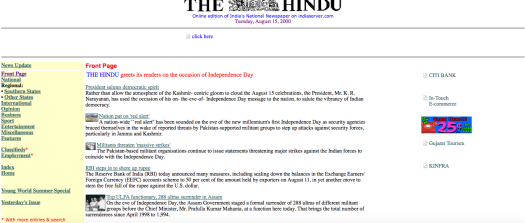
As early as August 2000, The Hindu introduced ads on their website, with flashing images lining the side (Call India 25 cents/m!). Each article also had a link at the bottom which read “Send this article to Friends by E-Mail” and looks like a throwback to what is now the popular “Share” button on all online publications. The homepage looked a lot cleaner, and the title appeared in a bright red and blue font. The mobile design was the same as the website design at this stage.

Looking at their website now, there are many improvements. The website allows the reader to access the news in two different ways. The reader has the option of reading the digital publication in the same way they would read the physical newspaper via the “Today’s paper” link. Through this method, you can read the newspaper articles in order and bundled as in the physical paper. The other option is to read the paper by jumping through different sections via the drop down menus. The drop down menus are quite specialized, allowing you to find cricket news, for example, not just under “Sports,” but also directly under “Cricket” or “Hockey.”

I also like that the homepage isn’t littered with many photos. There are a couple, but they aren’t overwhelming. Instead, they provide context to the top story of the day and direct the reader’s attention there. The logo is clean, as is the easily clickable Facebook, Twitter, and Instagram widget which connects the publication to different social media platforms. There are no ads on the current website.

The Hindu is considered to be a serious publication, and therefore uses simple colors on the website—white and grey, and a stark blue logo—which make it look clean and elegant. This image fits with the brand of The Hindu. The website loads in less than a second, perhaps due to the lack of videos and images on their website. There is also a comment section at the end of each article, but this seems to be rarely used. On the other hand, the Facebook and Twitter share buttons show numerous likes and shares, so the community therefore seems to be active on these social media platforms.

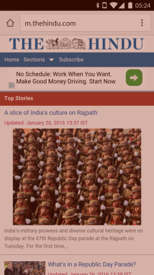
The mobile website does seem to have a longer load time of about 3–4 seconds, and it loses some of its desktop features. For example, there is no daily newspaper; instead it is divided by subject matter. The m.hindu.com website also seems to have an ad banner which is missing from the full website. Overall, the mobile design is a little more clunky than the website design. I think it would be helpful to have a sidebar that pops in and out and divides the paper instead of users having to scroll through sections such as “Breaking News,” “Editorial,” and “Magazine.” Despite what it lacks, it serves well as a companion to the full website. But if readers are looking for a cleaner and more streamlined experience, The Hindu is best viewed in its desktop version.

The Hindu mobile version

What’s Next?

From type writers, fax machines, and computers that filled rooms to laptops, ipods, ipads, and phones that tell us exactly where we are in the world and connect us to every form of social media that’s been dreamed up and any bit of information available to humankind. This last is being only so long as the internet remains free (uncensored).

So, what is next?

Google Glass and Swatches?

The hands free aspect of Google Glass is certainly attractive and of the two I can see it taking off a little more quickly, if the price is right. It really would depend a lot on what shape these new technologies take.

Smart watches

Pebble Smart Watch
Pebble Smart Watch

One of the greatest issues I see being an issue with smart watches is durability. Once phones were like bricks and could be thrown across the room, fly off the top of a car on the freeway and when retrieved still be able to make a phone call or send a text. Phones now would be going to the apple store for replacement. I don’t know how often I see friends post, “my phone’s dead, fb message me to get a hold of me.” For me to wear a smart watch it would have to be water proof and survive getting banged up. I wear my watch while sailing, and sometimes I go swimming.

As a biker I lover this idea

pebble on a bike
Pebble on a Bike!

However if it’s pouring down rain, I’m still going to be biking to class.

The reviews I’ve read show the swatch as being connected, almost like an accessary to your various other devices. I imagine it would be able to connect to a phone even if it’s somewhere else and using the gps info from the phone it wouldn’t be very good for directions, but could tell you wear you left your phone. Whether this would help my friends who I can never reach however smart their phone is, I don’t know. All these devices run out of power and if you don’t have a charger with you… Well the problem isn’t really solved.

Google glass on the other hand seems like a more revolutionary idea.

googleglass

Maybe it would help people look up and see the world again. The hands free aspect is attractive. With one of these I could find out where which way I need to go without pulling my bike to the side walk, trying to figure out by what I see, where I am, and look at my directions to figure out where I might have missed a turn. I could get a smart phone, but that would still involve digging around in a bag.

I wonder though about whether the display out of the corner of my eye would just become an irritating distraction, blocking vision.

I’ve read about how this could lead to the possibility of hands free books which I could see causing so many problems at intersections. Besides we have audiobooks.

But what would the world look like. Instant information, the ability to be more present without detaching from online connection. Instant sharing of every aspect of your life. As the future progresses technology is coming closer and closer to our person and lives are no longer private. It takes a lot of trust in the world to shout out where you are and what you are doing at any given moment. And not everyone wants their life to be an open book on the internet.

leavetheseoutside

But what happens when technology gets even closer and all it takes is a thought to send a message, to say hi to your family. Telepathy could be just around the corner.

My cousin’s husband works at apple and can’t wait for when the new technology is an implanted computer chip, but myself I am a little wary. Who can hack and control the chip? I don’t know that I’d want everything I think to be public.

Let me know when teleportation is invented so that I can visit all the people and places I want to at a moments notice, see them face to face, and be able to give them a hug.

Form Follows Function with HTML5

Are you ready to have your mind blown? Form Follows Function is Jongmin Kim‘s brain on HTML5.

Kim is an interactive developer at firstborn multimedia in New York, and Form Follows Function is his most recent venture in website design.  He’s developed a collection of his favorite things, a combination of Vincent Van Gogh and Minimal Design, Andy Warhol and Typography.  Presented as a clickable color-wheel, each slide brings you a new interactive opportunity, from perusing the universe to planting trees.  It’s times like these when I really wish I had a smart phone…

As Rachel pointed out, Adobe Flash is a thing of the past.  It’s falling behind in the times of adaptability, and HTML5 allows for content to run on any device with any web browser.  Developing responsive web design with HTML5 gives developers the tools to design layouts that will fit any screen size.  Many designers are thinking mobile first, using the mobile experience as the foundation to build from.

HTML5 is still in development, and one can only imagine what other designers with Jongmin Kim’s kind of code of conduct are coming up with. Check out 50 amazing examples of HTML5 to satisfy your curiosity.