Postcrossing

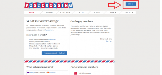
I don’t visit a lot of different websites, but one with a design that I like is Postcrossing, an international postcard-swapping network.

Their layout is clean and intuitive, and I like how it reflects the project’s snail-mail initiative – through blue and red stripes reminiscent of airmail envelopes and the stamp shape on the logo – without being too “on the nose” or overbearing. They also make the main things you might care about as a user the first things that you see when you log in to the site, such as the progress of your postcards, and your stats.

Despite their more traditional grid, color scheme, and menu style, there is a modern prioritization of white space that indicates active and attentive site management, forgoing clutter for simple blocked out widgets that don’t crowd or compete with each other. The organization and focus is precise and flowing, and is probably my favorite thing about their design. They also utilize a modern icon style for the sent and registered postcards, with enough detail to be cute and unique but remain consistent with the minimalist design from the rest of the site.

I know it’s sort of a trend right now for many websites, but another thing I really like about Postcrossing’s site is that there isn’t some huge screen-filling graphic and/or registration form on the home page that I have to find a way off of to get to the actual site content. The log-in button is easy to find, and they tell you right away what they’re about instead of making you hunt for it.

See, easy peasy

I’d like to incorporate this sense of purpose into my site’s design, focusing more on getting users to what they’re trying to find and less on things moving around on the screen or making people feel compelled to sign up for something. I also like that there isn’t a whole lot of busy content to sort through on each page, especially moving horizontally across the screen; sites with three or four columns of wordy links really irritate me and make me want to leave. The color palette does a lot for me because it is a bit different from what I see on a lot of other sites right now – I’m not a big fan of the move to neon.

I really like the balance that the Postcrossing site strikes between negative space and active space. It feels functional while remaining neat, and I’d like that same sort of chic economy for my project.

One thing I like on other sites that Postcrossing does not use is a sticky menu across the top of the page for navigating to other pages. This site doesn’t have too many places where you end up scrolling for a while, but I like when sites give you “exits” to other parts of them without having to reorient to the top of the page, and a sticky menu does give off a modern vibe to me. Another consideration for my project is sidebars, which Postcrossing also does not use. I don’t usually care much for sidebars (fixed, sliding, or otherwise), but I recognize contexts where they are useful, and might end up needing something like that for my project. I tend to prefer the sliding sidebars, and think one would most consistently go with my other design goals.

The great and amazing process of learning HTML and then using HTML!

Six gifs that help explain how it feels to learn HTML:

  • We’ve begun learning allllllllllllllll about HTML and oh we also started utilizing every single fact immediately in order to build our personal websites. There’s a whole lot of retention necessary:

http://

via GIPHY

  • Good thing is that I’ve got tons of file space in my room..:

http://

via GIPHY

  • To be honest, I’ve been getting in my own way a lot:

http://

via GIPHY

  • Every time I think I’m doing something awesome it doesn’t turn out the way I expected:

http://

via GIPHY

  • The good thing is it has been a great experience to get to know myself!:

http://

via GIPHY

  • It’s great when something works out and actually looks decent on the website!:

http://

via GIPHY

Savory and Delicious: Bon Appétit’s Online Evolution

Bon Appétit 2016 Homepage

When it comes to the evolution of the Bon Appétit website, nothing has changed for the worse. Starting in 1998, the website was little more than a place people would visit to learn about subscription information. It featured the cover image of the magazine, a few links, and some staff information. There were multiple mentions of Epicurious, which was launched by CondeNet, a subsidiary of Condé Nast (of which Bon Appétit was a property). In this first iteration of the website, one banner ad at the top of the page says things like, “Tell Us Your Age” or “Do Men Find Successful Women Sexy?” To reference the “User Experience Basics” article from Usability.gov, this version of the website is not valuable, desirable, or very useful. The most useful thing about it is the recipe search bar that has been a feature of the website since the beginning.

In 2000, there was a significant design change that featured more color throughout the website, a paragraph of text related to that month’s issue, links to books written by the editors of BA, and a lot more information on subscriptions. And, thankfully, the slightly creepy banner ads were done away with. Beginning in 2001, Bon Appétit starts to create an online culinary-based community. The website now includes content that you might find in the magazine. It’s more than just the recipes now; it’s the restaurant guide, the test kitchen tips, and other useful information that BA foodies want. In 2007, their design got another huge makeover and they began featuring podcasts, giveaway sweepstakes, and BA blogs on their website.

After 10 more years of subtly tweaking the website, we have arrived at 2016 and the most modern iteration of the website. The links at the top of the page make navigating the site very easy. They help direct the user to the main departments of Bon Appétit: Restaurants & Travel, Entertaining & Style, Drinks, People, Events, Test Kitchen, Video, Recipes, and Subscribe. In addition to these departments, they have a “Popular” section that lists clickable boxes of what is being talked about most in the world of cuisine (today: labneh, matcha, gluten-free beer, cooking with kids, etc.). I think most of the advertising is branded content, or native advertising, because there are no banner ads on the website.

Overall, the website is beautiful. It features large, high-quality, colorful pictures of food surrounded by lots of white space, modern black text, and pops of yellow throughout. Additionally, the content is current and relevant while being entertaining. For example, this weekend, they had an article called “What We’re Cooking This Blizzardy Weekend,” which is hilarious to my fellow Northeasterners who are struggling through Storm Jonas. In terms of their special elements, Bon Appétit’s videos are not integrated into the endless scroll of the site. There is a section called BA Videos and links to their popular series: “BA Test Kitchen,” “Shot and a Beer,” “Celebrity Chefs,” and “All Videos.” I like this style of organization because I prefer a site that isn’t cluttered and over-stimulating. If you want to see the videos, you have to click to view them and it loads quickly.

The mobile version of the site is also excellent. It has a drop down menu with a list of all of their departments and an endless scroll of the same information on the website such as clickable articles, swipeable slideshows of recipes they’re currently cooking, photo essays of what vegetables are in season, etc.

On both the desktop and mobile sites, the emphasis on social media is strong. They strive to create a BA community and it’s evident with their use of Instagram and their RSVP section. They have snapshots of their most recent social media posts and call it “BA Social.” They are most active on Facebook and Instagram. Instagram is a great platform for them because of the spectacular photos they always feature. In addition to social media interaction, they also have a great user community because of the RSVP section, which is the longest-running column in the magazine. Say you go to a restaurant and have the best roast duck of your life – you email Bon Appétit and tell them about the dish, they hunt it down, test it in their kitchen, and it’s either featured in their magazine or they just email you back the recipe. They do multiple RSVPs per issue.

I’m so excited to see how the website has grown and evolved over the years. I think Bon Appétit performs extremely well as a website in addition to being a well-loved magazine. They make smart choices in terms of design and not over cluttering the site. The helpful links at the top to their main departments help organize the site in a way that is clear and effective. The aesthetic of the site is fresh and fun. I love to see how they’ve taken a food magazine consisting of mostly recipes and, through the website, created a little microcosm of everything foodies, like me, love to know about.

Out of the Dark Ages of Web Design: The New Yorker Website (1998-present)

The New Yorker Homepage as of January 2016
The New Yorker Homepage 2016

The first digital existence of the New Yorker appeared at the end of 1998 featuring little more than a search bar where users could click on the article they would like to read and press “Go.” Even this search bar isn’t very user-friendly as it doesn’t allow for readers to type in key words and restricts them to just select articles. As for ads, there is a changing banner running along the top that says things like “I Eat Out __ Times per Month”, “Tell Us Your Age”, and “Do Men Find Successful Women Sexy?” Thankfully, everything about the original website has changed since!

Fast-forward to present day and the website’s design is as sleek and classy as the magazine’s reputation. The website is predominately white with black and red text, but the colorful images connected with articles bring some life to it. The eye is initially drawn to a large photo featuring that day’s headline story with the headline, author, and deck to the right. Underneath the large New Yorker logo there is a link bar covering a variety of categories such as News, Culture, Books, Science and Technology, and Cartoons. Even Audio and Videos get their own link! By separating them from the rest of the content, users are allowed to choose if they want this kind of experience without forcing it.

A banner advertisement runs along the top of the page, one in the middle, and one the bottom with at least three blocks of ads on the right hand side. Half of these ads are for the New Yorker and the rest for outside companies. With such a low number of ads on the main page and the videos stored separately, the load time is very low. Users are lead to social links if they wish to share or comment on the articles, but what’s missing is the ability for users to comment directly on the site.

On mobile, the links fold into a hamburger bar next to a smaller logo. The image connected to the headline story sits just below the logo, still making it the first thing the user sees. There isn’t much variety to the layout of articles in the mobile version. On the left hand side there is a small image and on the right side there is the headline, author, and the deck.

The New Yorker website has come a long way since 1998 and has definitely changed for the better! It wasn’t until spring of 2007 that the website started to resemble what it is today and even since then it has improved greatly! Not only is today’s website clean and readable, but it is user-friendly and easy to navigate. For a brief time in 2000, the New Yorker experimented with color for the first (and last) time. If I could recommend one feature of the old New Yorker to return, it would be that little bit of color.